
Nick has 9 years of experience in game development. He started as a game designer, ran the Fast Forward studio, and for the last two years has been working in the hypercasual industry as a producer, and also has experience with midcor projects for 5 years.
It you follow the top charts of games in either store be it iOS or Andriod, often enough you notice that simple, but addictive hyper-casual games occupy the top positions. That's why the interest in developing these games is also growing.
- Scene objects location
- Choice of colors
- Try pre-made color palettes
- Use the color circle
- Avoid very bright colors
- Set up the color proportions
- Setting up the shaders
- Here is a step-by-step guide on how to set up the shader:
- Adding textures
- Finishing up with the details and interfaces
For those who want to dive deeper into making hyper-casual games, here's a detailed and illustrated guide on how to make a stunning scene & graphics in a hyper-casual game.
1. Scene objects location
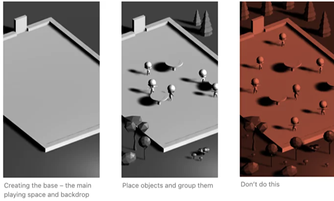
Before starting to work on the graphics, it's vital to make decisions on white boxes and object locations. Try to avoid placing similar objects at the same distance from each other. Instead, it's best to bundle up objects of different sizes.
For example:
- Place a big spruce tree next to a small one, with empty space around them;
- Place tiny characters standing around big tables;
- Place a big tree next to a small one, and add a very small rock next to them.
If you place objects randomly all over the scene, there won't be anything specific for the eye to catch, and the scene will become a visual mess:
2. Choice of colors
The starting point and the most important step of visual scene setup is to choose the base color. Once this is done right, everything else will be significantly easier to adjust.
Choosing the right colors out of millions of hues is tricky, so it needs to be simplified by limiting the options. Here are some ways to do so:
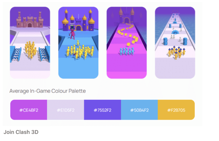
2.1 Try pre-made color palettes
Look for a publisher that focuses on hypercasual games, not casual or hardcore/mid-core genres. Then, compare how different publishers pay developers and split the profits. Check out game development communities on Reddit, Slack, or Discord to find out what other developers say about the publishers they worked with.
2.2 Use the color circle
Adobe color circle is another classic color choice option. With this easy-to-use tool, anyone can create a 5-color palette for free. Once one small circle is moved, the tool adjusts other colors to match the rest of the theme automatically:
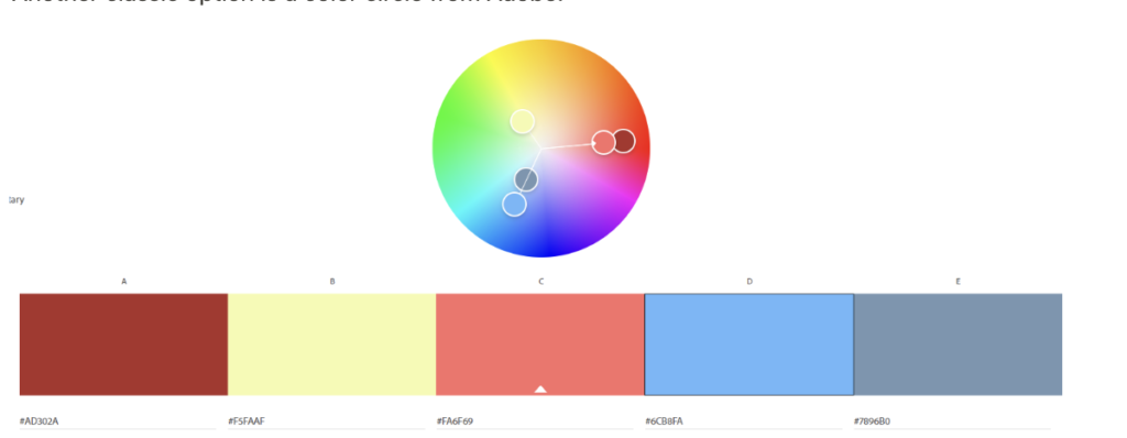
With this option, some knowledge of color is needed to make an eye-catching palette. but the result, in this case, depends more on the creator, and it is much easier to adjust the palette to the team's vision and needs.Here are two basic principles on how to use the circle correctly:
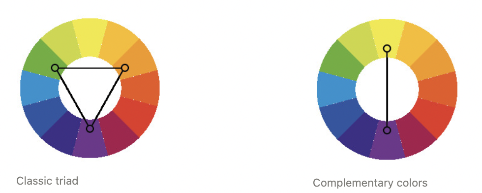
- Color triad – picking colors from a triangle;
- Complementary colors – picking the opposite colors from the circle.
The Adobe Color Wheel has presets for both triad and complementary colors.
2.3 Avoid very bright colors
Basic bright colors are always harder to work with than muted colors, so using more pastel and calm shades is preferable. The simplest and brightest colors, which are usually taken from the upper right corner in the Unity color palette, are very active and argue with each other. The scene turns out too bright, and the colors don't combine well.

Once bright colors are replaced with calmer shades, the scene might seem dirty and gray at the first glance. This initial perception will be fixed in the next stage of shadow adjustment.
2.4 Set up the color proportions
Objects shouldn't be equally colored in different colors, otherwise, they will just break up into groups that are hard for the eye to put together. One-color should be dominant and prevail in the scene. Two or three colors that are close to each other also would work. The other color should be the accent color and used less.
For example, in the scene above, the main color is yellowish-green, and the accent color is white, which is used to draw attention to the little characters:

3. Setting up the shaders
The shaders allow turning an unfinished scene into eye-catching graphics. Setting up shaders properly helps achieve beautiful, clean colors, and a stylized cartoonish look.
Black shadows are what you should be avoiding. Cartoon-looking shaders make the scene look more casual-genre. This type of shadow also makes working with this setting a lot easier.
The key principle is again setting up a limitation. As a rule, there is a side of the object that is lit and a shadowy side. Both sides contain one color in all places and no halftones.
The shadows shouldn't be too dark or seem dirty. This feeling is created when black and gray colors are used, so it is better to make the shadows colored — blue, green, or purple.
Unity Asset Store offers a variety of shaders that are free and simple to work with, For example, here is the Flexible Cel Shader in use:
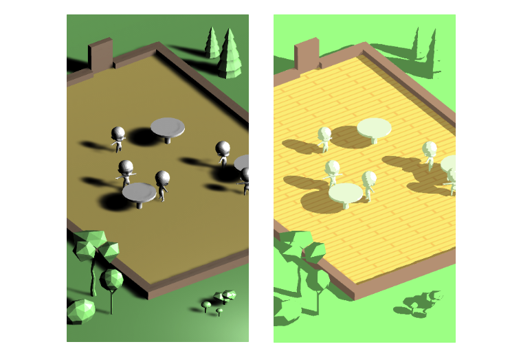
Here is a step-by-step guide on how to set up the shader:
1. Create new material, for example, the floor. Choose a shader without an outline.

2. In Base Color and Textures, select the texture for the object. In this example, I want to use a plank pattern, so I load a picture with it in the needed color. If there is no texture, then the picture should be just a solid color, selected before.

3. The Global Color Modifier allows changing the color of the whole object at once. For example, it can add some reddish hue to the floor color. If the initial color looks fine, this step could be skipped.

4. Lighting Ramp allows adjusting the boundary between light and shadow. The default setting is two ramp levels or gradations of shadows in other words. Changing this parameter allows for adding more gradations.

5. High Light allows adjusting the color and brightness of the illuminated part of the object. I'll leave the color white, and adjust the brightness so that in the scene the object looks as close as possible to the color I originally intended (not too dark, but not over-lit).

6. Low Light is the same thing, but for shadows. It's best to choose the color that will be superimposed on the texture in shadows and adjust the intensity so that it is slightly darker than our main color. It's highly recommended to avoid black or gray color.

7. Finally, we can adjust the color and size of the outline if we need to. We don't need to do that for the floor, so we'll skip this part.

All the other textures are adjusted in the same way: setting the base color and adjusting the color and the saturation of the shadows according to the game's needs.
4. Adding textures
Realistic textures are almost never used in the genre. In the hyper-casual design, the term texture stands for any patterns or simple drawings on objects:

There are 2 main rules for adding those patterns:
- Do not use more than 2 textures per scene. Textures are elements of the decor, that draw the player's attention. They should be an interesting detail, not an overwhelming distraction.
- Texturize big empty spaces, but not little ones. Small objects create enough detail on their own, so it's better to not overload them with additional textures. Otherwise, the objects will be too flickering, and the space will become too disjointed.
Look at the table decoration example: when the entire table is texturized, it looks too shallow on the sides, and it is hard to look at it. But that's can be fixed by making the side of the tabletop single-colored:
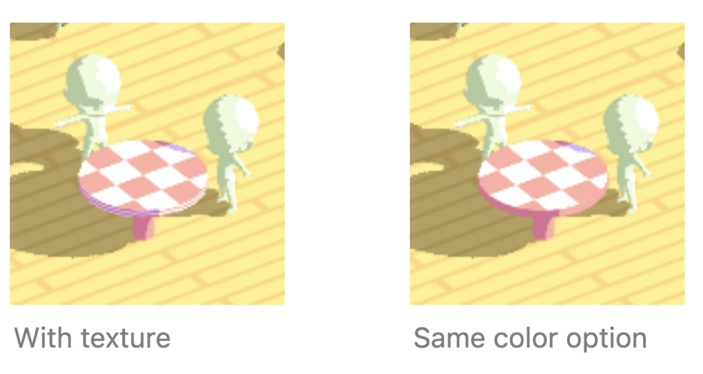
5. Finishing up with the details and interfaces
We made a good base for the scene, but it's important to remember that details make the scene look complete and beautiful. Here is what you should pay attention to:
Add some extra colors. It's recommended not to deviate from the basic palette too much:

Add some tiny objects. Make the space more interesting by adding such details, as a door handle, a rug, a window in the wall, etc. It's important not to go overboard.Add an outline to highlight some objects. It's recommended to highlight the main character and important objects with an outline.

Here is how the scene has transformed with the simplest details:
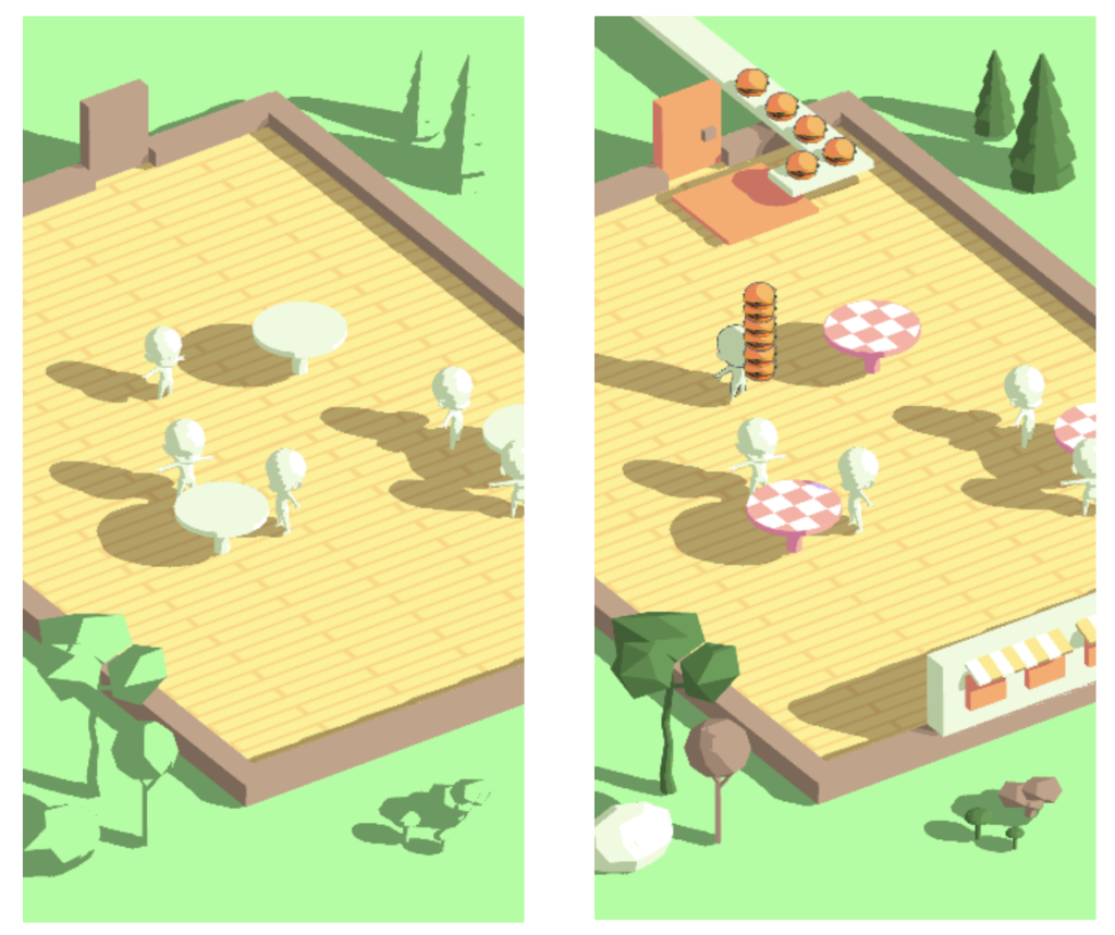
Add clothes and accessories to characters. While almost everything here is done with Unity's basic geometry, it's still possible to go further and make the characters look more detailed and the furniture shapes more complex. The next logical step is adding interfaces.
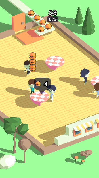
When it comes to adding interfaces, there are a few key principles to follow:
- The simpler, the better. Don't make the interface too complex, detailed, and loaded with "pretty" things to look at. Simple vector forms are fine.
- Try to make maximum contrast. The interface is something that should be clearly visible, so you need to make sure that nothing merges with the background, no white on white and black on black. It's better to add a border so that the interface is clearly distinguishable against any background.
- Stick to a unified style. Do not make some icons bright and rounded, and others translucent and with sharp corners. Try to make the interface generic.
When it comes to learning or trying to create something new, the best way to understand how things work is to practice.It is useful not just to start from scratch, but to familiarize yourself with the finished project and try to change the parameters already set up to see how they change.With that purpose, here is a demo scene created for self-study. Follow the link, download the file, and enjoy exploring and experimenting with the scene.

-02.png)

-01.png)